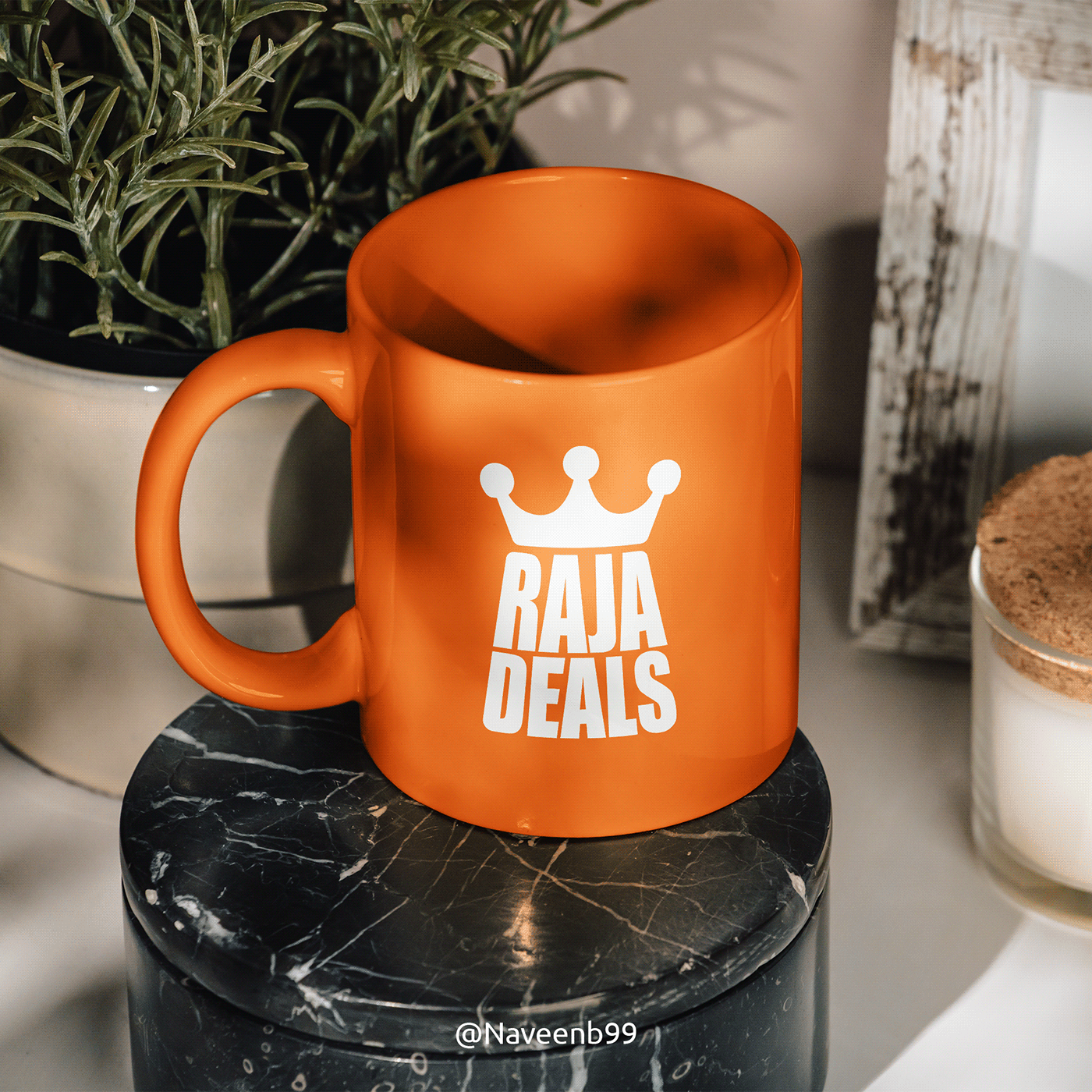


Raja Deals is a Sri Lanka-based e-commerce platform primarily focused on home appliances, electronics, and lifestyle products. Their name "Raja" means king or king’s, and in designing the logo, a crown shape was incorporated to symbolize this regal association. The text shape resembles a shopping bag, reflecting their platform. They invite people to shop on their e-commerce platform as if they were kings, as they offer incredible and unbelievable deals for their customers. The three dots in the crown represent the company, products, and customers, signifying their interconnectedness and importance. Without these three elements, the business cannot thrive, and they prioritize treating their customers like royalty. For the color scheme, white and orange were chosen as the main branding colors. In design, orange symbolizes warmth, energy, and creativity, fostering optimism and joy while inviting connection and openness. Its friendly nature and association with refreshment make it versatile, whether evoking adventure or balance. Orange enhances designs, infusing them with vibrant emotions and meanings. In design, white represents purity, simplicity, and openness, creating a clean, peaceful atmosphere. It adds a minimalist touch, enhances spaciousness, and highlights other elements for sophistication and elegance.


